
thumbnail of the forest area
I wanted it to look more "jungle-y" and it comes off as more "woods-y"

Sketch of Lancelot character [Jeff helped me alot]
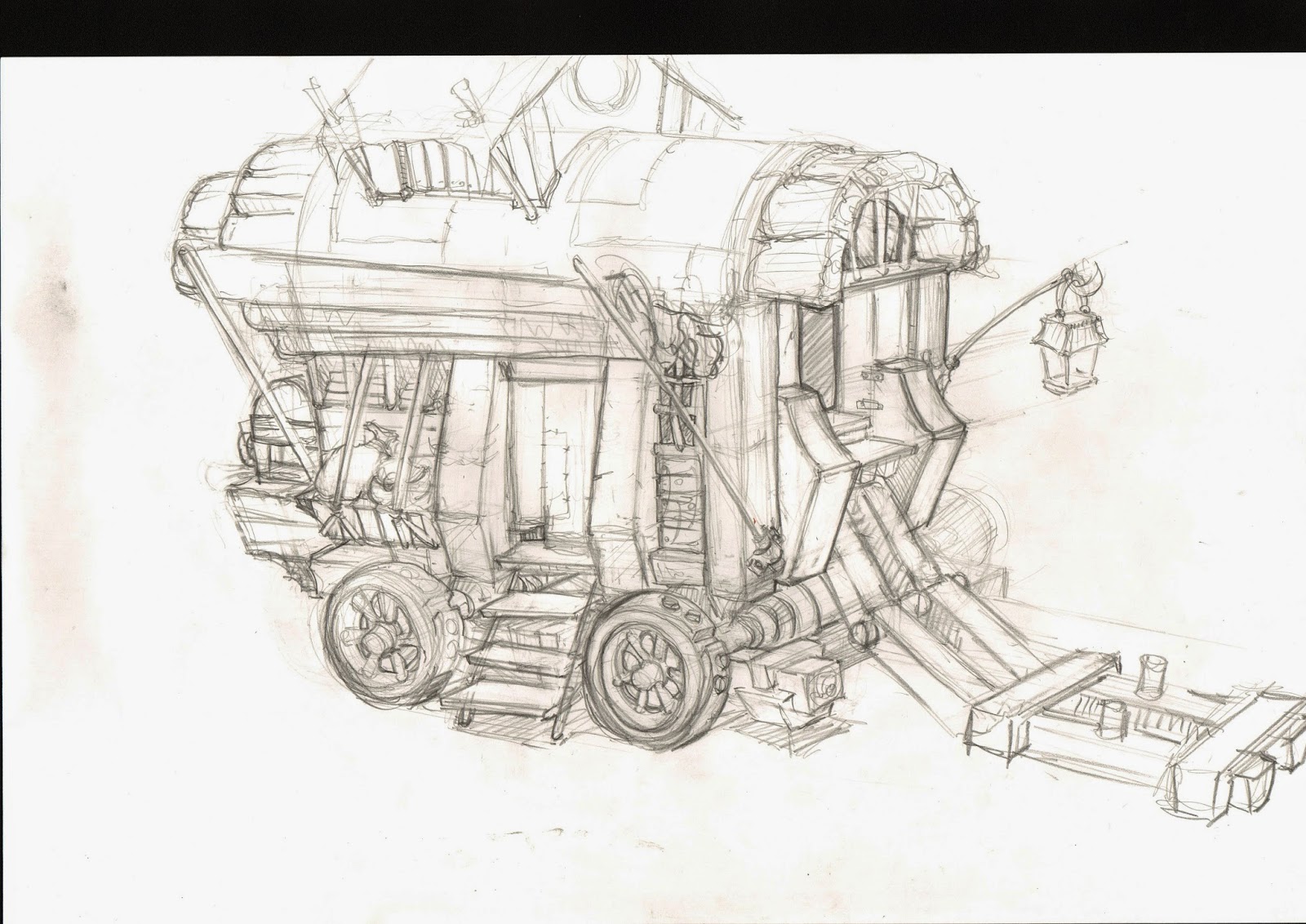
beginning sketch of wagon, will add second top page

from last Saturday, I didn't do much just touched up in some areas.
Actually, forest thumbnail has nice lighting. just define more and be more clear about the shapes. Make sure you have at least 5 or more on Sat. But keep the lighting and value like the first one you did. For the lancelot, I don't think it's working that well. It looks just medieval armor to me. And let's not put that flapper thing from his head. it's kinda distracting. Key thing here is that you should design the character, not putting the realistic medieval armor together. It should still look little more fantasy than just medieval. If you are more comfortable with doing line thumbnail than block in, that is fine. But it has to be more defined and cleaner besides all the design stuff I just talked about. So let's have different version of thumbnail or rough sketches about lancelot including his face. Also, there is no reason to keep that helmet design. Wagon is on right track. just go ahead and finish this first. Color environment look better tha before. But let's give variation on color ( temperature change) of roof tops. When you think about different colors, do not try to apply different hues to everything. Even they are littke different than in temperature, consider that as different color. But you have desaturated purple on all the roof tops now. Let's try that.
ReplyDelete